CASE STUDY 01 · SEVIMA · Education Technology

Streamlining Student Admissions for 50% Faster Completion

How I turned a long, multi-stage admission process into a journey applicants can follow on their own.

Product
SPMB Front
Industry
Education Technology
My role
UI/UX Designer
Platform
Responsive web · desktop & mobile
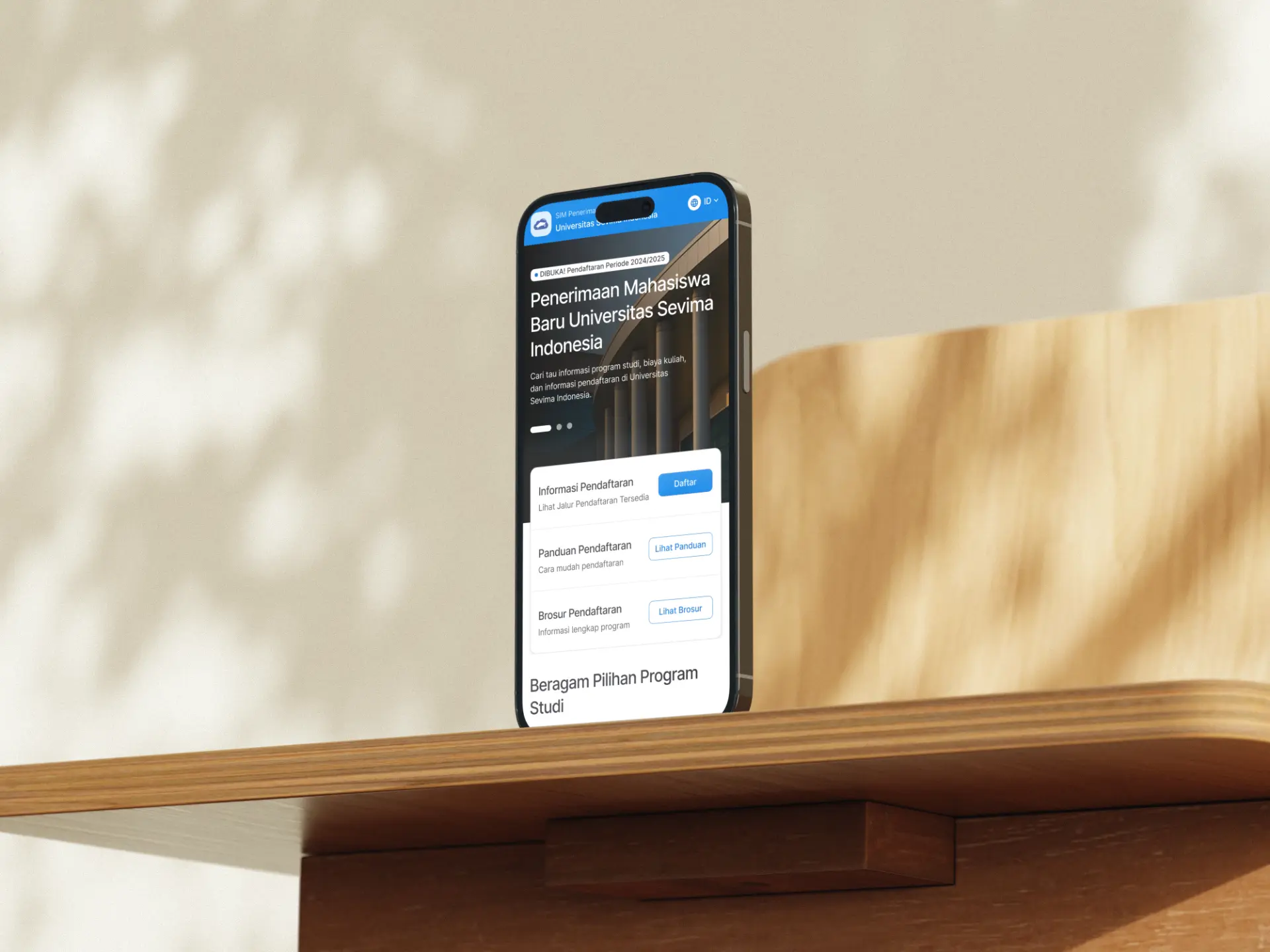
Streamlining Student Admissions for 50% Faster Completion — product overview
01 · The context

One portal, six stages, two very different users.

SPMB Front is the student-facing admission portal in SEVIMA’s higher-education platform. Applicants use it to explore paths and programmes, register, pay, upload documents and follow every stage until re-registration.

Prospective students · 17–22

Search and register by themselves, often on a phone.

Parents · 40–60

Advise on the choice and pay; some rarely use a laptop.

  1. 01Find a path
  2. 02Pick a programme
  3. 03Register & pay
  4. 04Biodata & files
  5. 05Selection & result
  6. 06Re-registration
02 · The problems

Where applicants get stuck.

PROBLEM 01

Too many options, no clear starting point

Paths, waves, programmes, dates and fees all compete for attention, so comparing options is hard.

In testing, one applicant missed the path menu on desktop, and a parent found programme names weaker than the fee badges.
PROBLEM 02

Long forms with mixed requirements

Registration mixes personal data, school, programme choice, payment and documents.

Testers could not tell required from optional fields, and the biodata step felt long.

PROBLEM 03

Lost between stages

Selection, results and re-registration happen over weeks, so applicants lose track of where they are.

One tester assumed there were only three steps, based on the home page.

PROBLEM 04

Rejected files without guidance

A generic “rejected” leaves applicants guessing what to fix.

Document review was added to the journey in the 2026 update.

03 · My role & approach

From user flow to tested interface.

What I was responsible for

  • User flows and page structure across the whole journey
  • Registration forms, labels and UX writing
  • Applicant dashboard, statuses and document states
  • Responsive desktop and mobile layouts
  • Usability-test planning and findings with the PM and engineers

How I approached it

  1. 1.Map the journey and the decisions at each stage
  2. 2.Identify friction and turn it into design targets
  3. 3.Make information scannable, break tasks into steps and keep patterns consistent
  4. 4.Design and test with students and parents, then iterate
Scannable informationTasks in clear stepsConsistent patterns
04 · The solutions

Every decision traces back to a problem.

SOLUTION 01 · Admission information

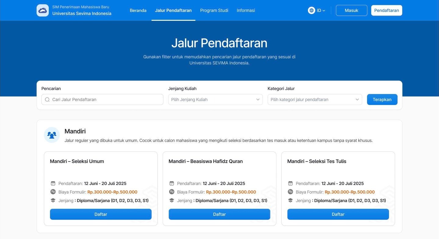
Make every option comparable at a glance.

Many paths and waves, each with different dates, fees and levels, made it difficult to compare options or know where to start.

Admission information
  1. 01Filter first by level and category before reading.
  2. 02Group paths by category, each with a line on who it is for.
  3. 03Show the same facts in the same order on every card: dates, form fee and level.
  4. 04Give each option one full-width action.

WHY IT WORKS

A fixed order of facts turns reading into scanning, so comparing ten options takes the effort of comparing two.

SOLUTION 02 · Registration form

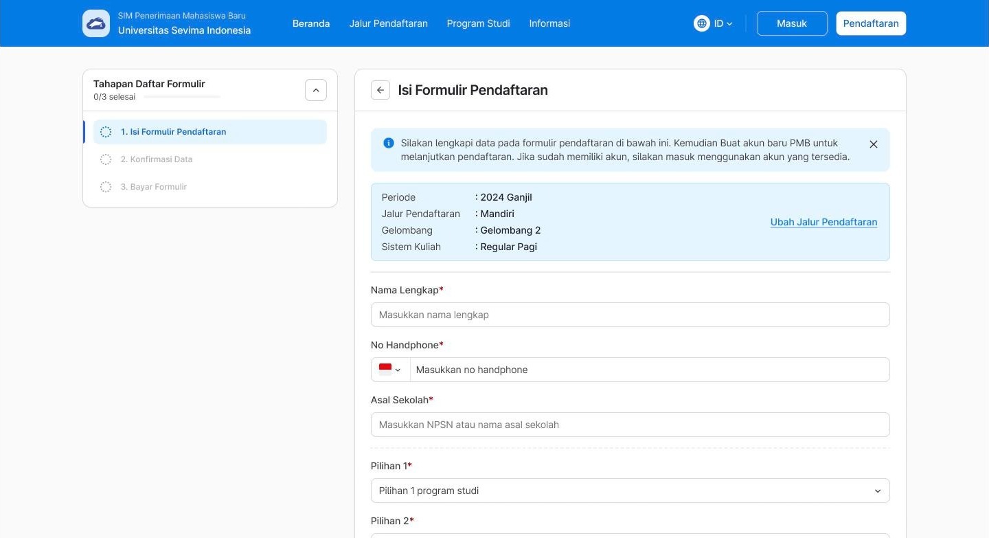
Break the form down and keep the context visible.

A long form mixed requirements and made applicants unsure about the steps and their chosen path.

Registration form
  1. 01Use three named steps and a “0/3 completed” counter.
  2. 02Explain up front that the account is created inside the form.
  3. 03Keep the selected path visible, with a link to change it.
  4. 04Use clear labels and required markers on every field.

WHY IT WORKS

Short steps make the task feel finite, and visible context prevents wrong choices before payment.

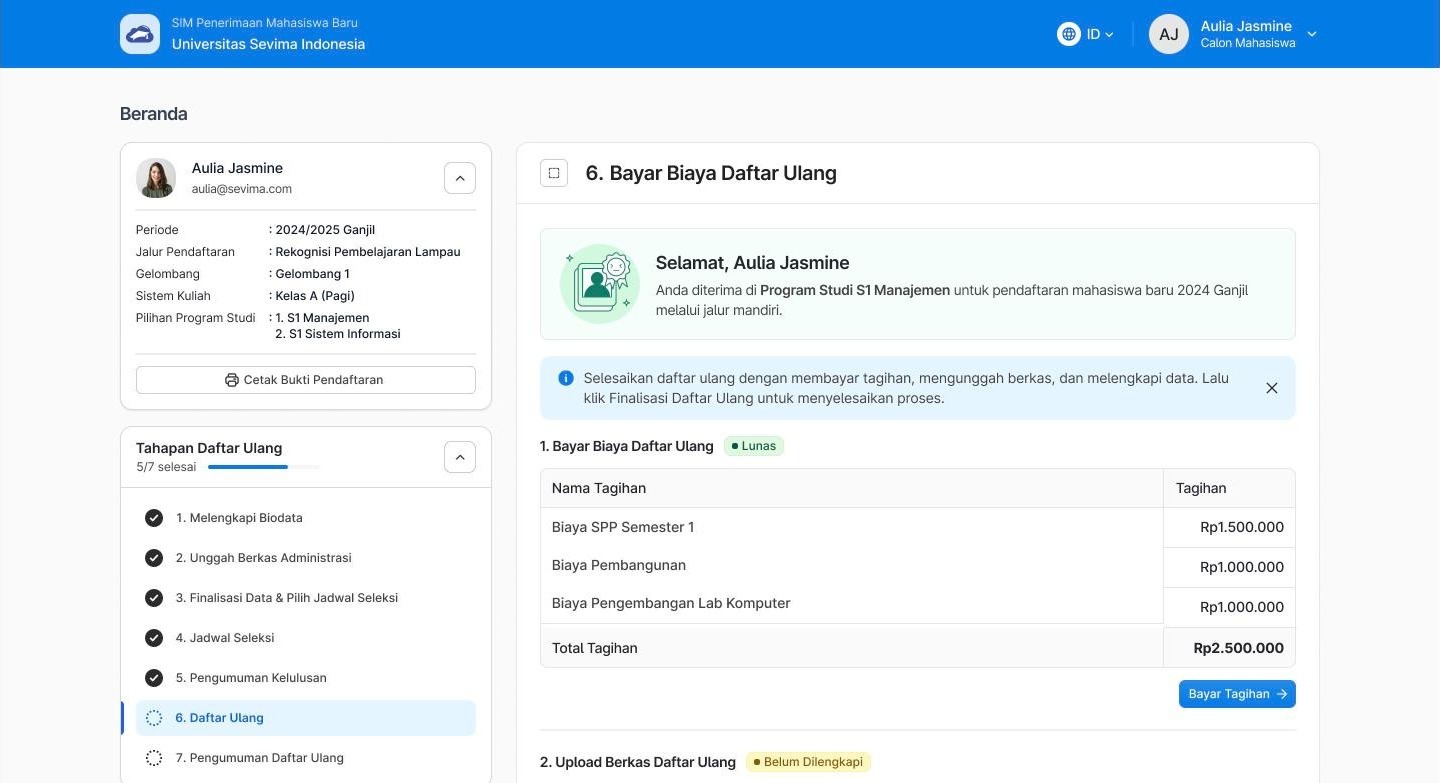
SOLUTION 03 · Applicant dashboard

Always show where I am and what comes next.

Returning applicants needed to reorient themselves across a journey that takes weeks.

Applicant dashboard
  1. 01Keep a persistent stage list with a completion count.
  2. 02Show the result and next action in one clear message.
  3. 03Place statuses beside the tasks they describe.
  4. 04Include an applicant summary to confirm path and programmes.

WHY IT WORKS

One page answers “where am I?” and “what now?”, so returning applicants reorient in seconds.

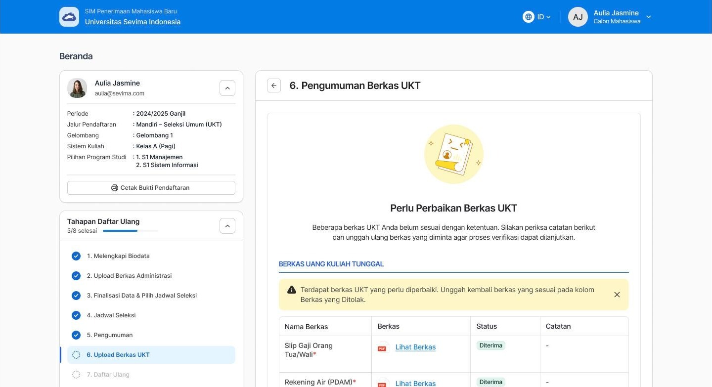
SOLUTION 04 · Document review

Tell applicants exactly what to fix.

A rejected document without an explanation creates uncertainty and extra support requests.

Document review
  1. 01Use plain-language “needs correction” guidance.
  2. 02Show a status for each document.
  3. 03Place reviewer notes next to the relevant file.
  4. 04Point applicants to where they can re-upload.

WHY IT WORKS

Correction becomes a single, specific action instead of a call to the admissions office.

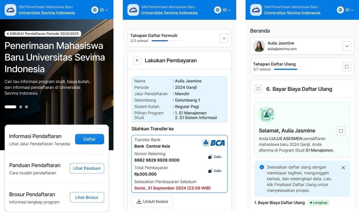
SOLUTION 05 · Responsive design

Same clarity on a phone.

Long pages and small targets slow applicants who register on their phones.

Responsive design
  1. 01Stack entry cards with individual actions.
  2. 02Add copy buttons for account number and amount, with a clear payment deadline.
  3. 03Collapse stage progress into one compact bar above the current task.

WHY IT WORKS

The same journey stays readable and actionable on a smaller screen.

05 · Validation & iteration

Testing the solutions with real applicants.

Moderated remote tests on desktop and mobile prototypes, with 6 participants each, covered the full journey. A time-on-task comparison against the previous system showed registration was 50% faster. Source: usability test records, 2024/2025.

50%

Faster registration than the previous system

6/6

Tasks completed by every mobile participant

4.7/5

Mobile rating for interface & navigation

Applicants treated every field as required

Label optional fields explicitly

The biodata step felt long

Split it in two, or allow saving a draft

Schedules showed no availability

Show open slots and remaining quota

A sticky pay button hid key details

Keep sticky actions for long, action-free pages

06 · Outcome & reflection

Designing beyond individual screens.

The redesigned journey gave applicants one consistent path from first visit to re-registration, and testing showed students and parents could finish it without help.

Solve the workflow first

Most friction sat between screens, so the stage list and status patterns mattered more than any single page.

Make requirements explicit

Testing showed that “obvious” conventions like a red asterisk are not obvious to everyone.

Design for both roles

Students and parents share one journey with different jobs; serving both clarified what to show first.

NEXT CASE STUDY

Designing 100% Traceable Construction Progress for Public Infrastructure