PROBLEM 01
Competing goals, no single action
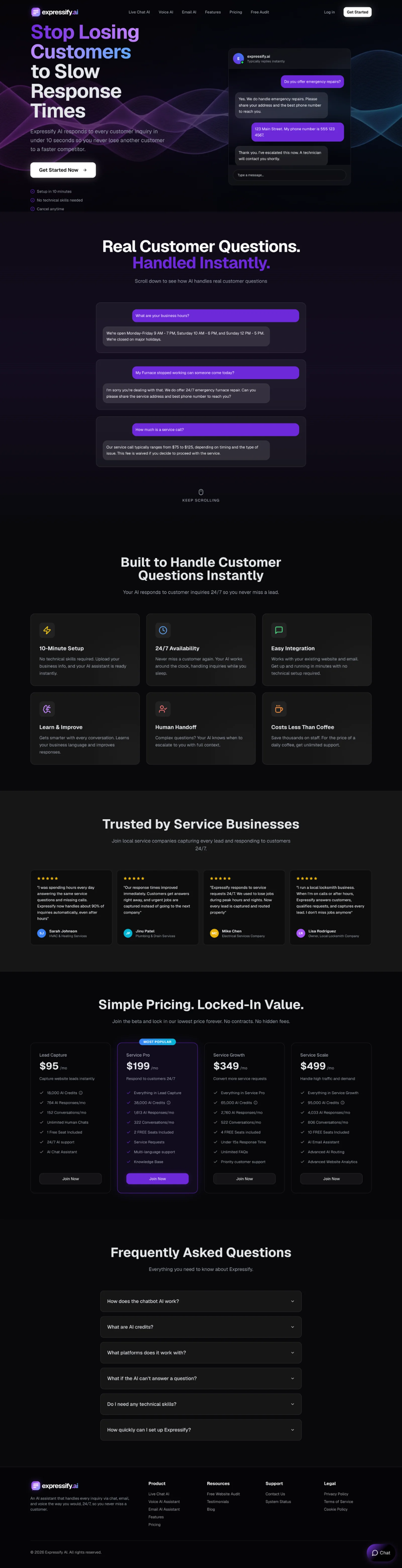
The page asked visitors to "Get Started Now", "Join Now" on four pricing cards, and "Log In" in the nav. None of them said "book a demo", the one action the campaign was paying for.
CASE STUDY 03 · Expressify AI · SaaS / AI Customer Service
How I redesigned a feature-and-pricing page into a single-goal landing page that shows the problem, the product and one way to act within the first screen.
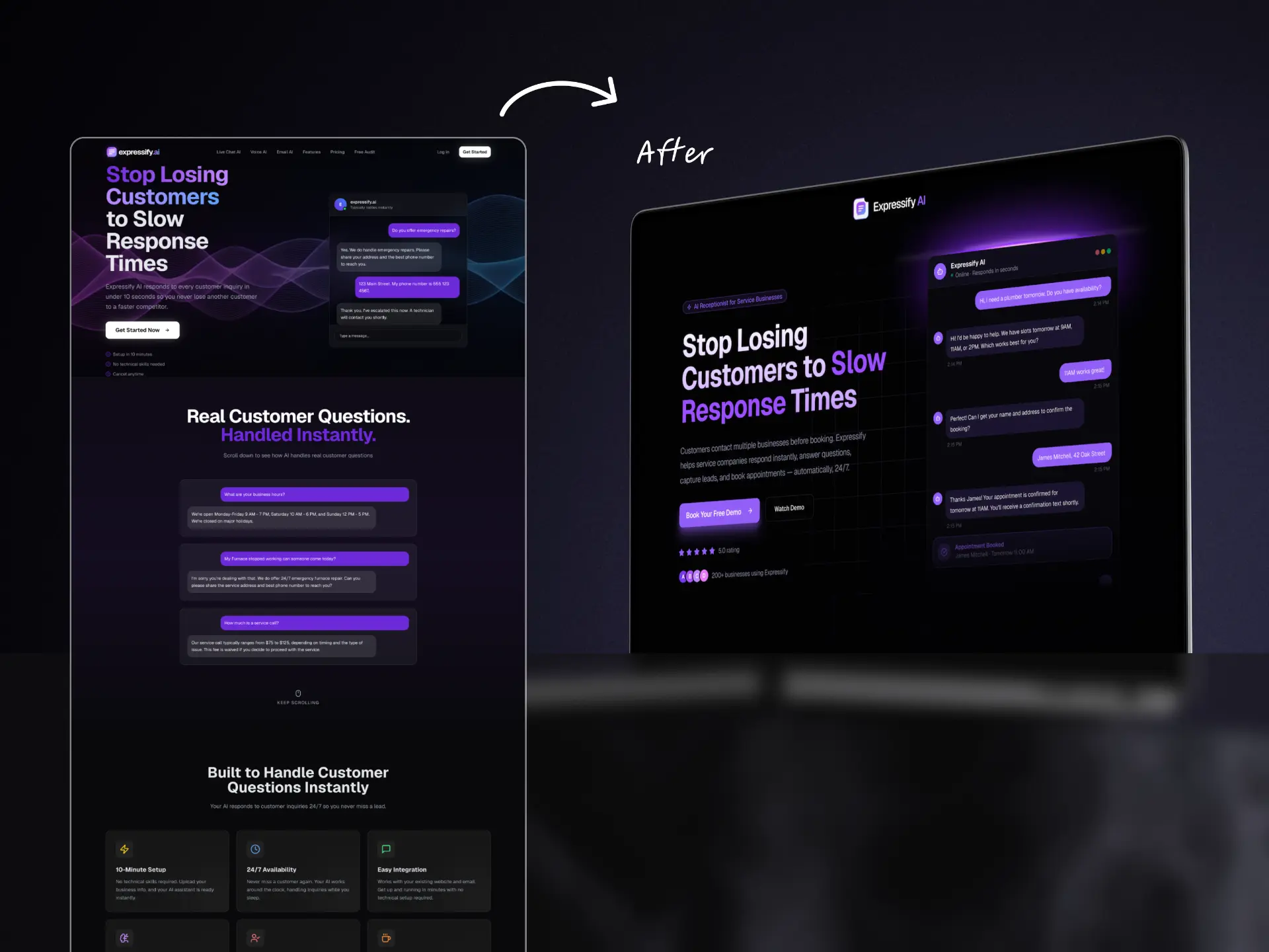
Expressify AI is an AI receptionist that answers customer inquiries instantly, captures leads and books appointments for service businesses, 24/7. The team was launching paid Meta campaigns and needed a landing page built for one action only: scheduling a demo call. The brief was clear about the audience. Visitors arrive from cold Instagram ads, have never heard of Expressify, and give the page about three seconds before they leave.
Plumbers, HVAC, electricians, cleaners. Busy onsite, often browsing on a phone between jobs.
That they are losing customers to slow replies, and that this tool fixes it without hiring anyone.
The existing page had strong messaging, but it was built like a product website, not a campaign page. I audited it section by section against the brief.
PROBLEM 01
The page asked visitors to "Get Started Now", "Join Now" on four pricing cards, and "Log In" in the nav. None of them said "book a demo", the one action the campaign was paying for.
PROBLEM 02
Four pricing tiers ($95 to $499/mo) sat in the middle of the page. For a visitor who met the brand seconds ago, a price table asks for a decision they are not ready to make.
PROBLEM 03
Cards like "10-Minute Setup" and "Easy Integration" described the software, not what a business owner gets: fewer missed jobs and more booked appointments.
PROBLEM 04
The chat examples answered questions, but stopped before the part that matters most to the buyer: the appointment getting booked.
PROBLEM 05
A full navigation, a four-column footer and a floating chat widget offered ways out before the visitor reached a CTA.
SOLUTION 01 · Hero
Cold visitors decide in seconds, and the old hero showed a generic "Get Started" button beside a chat with no outcome.
WHY IT WORKS
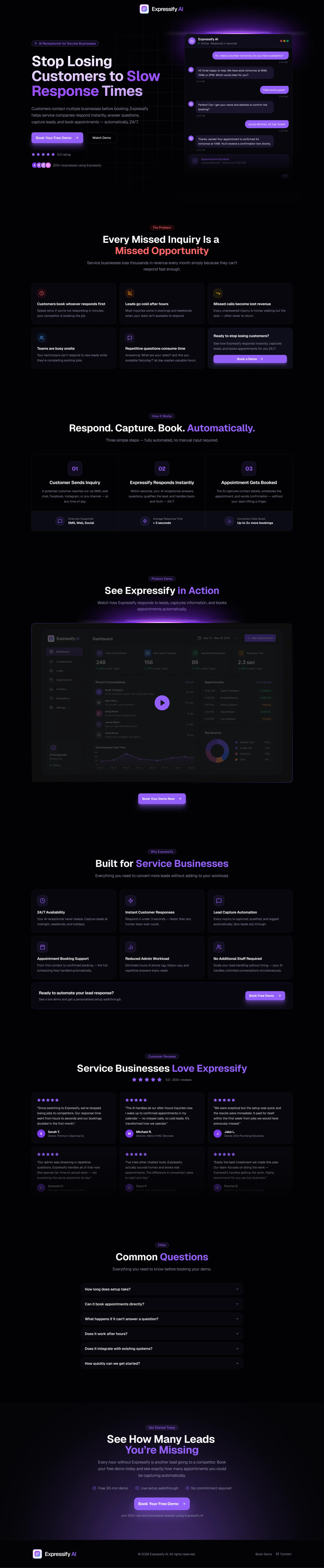
The visitor understands the product from the visual alone, and the only next step is the one the campaign pays for.
SOLUTION 02 · Problem section
The old page went straight to features. Cold traffic first needs a reason to care.
WHY IT WORKS
Owners see their own week in the page, and the CTA sits where that recognition peaks.
SOLUTION 03 · How it works
WHY IT WORKS
A three-step story makes an AI product feel simple enough to try.
SOLUTION 04 · Product demo
WHY IT WORKS
Visitors who watch are the most interested, so the booking button meets them at that moment.
SOLUTION 05 · Benefits
WHY IT WORKS
Owners buy fewer missed jobs and fewer hires, not an integration list.
SOLUTION 06 · Social proof
WHY IT WORKS
Reviews from people in the same trade lower risk more than any feature claim.
SOLUTION 07 · FAQ
WHY IT WORKS
Every answered objection removes one reason to delay booking.
SOLUTION 08 · Final CTA & focused shell
WHY IT WORKS
With no exits left on the page, attention has one place to go.
Before
After
| Aspect | Before | After |
|---|---|---|
| Primary CTA | Get Started / Join Now / Log In | Book Your Free Demo, one action |
| CTA placements | Hero and pricing cards | Hero, problem, demo, benefits, final section |
| Hero visual | Chat that answers a question | Chat that ends in a booked appointment |
| Messaging | Features (setup, integration, AI credits) | Outcomes (missed jobs, lost revenue, no extra staff) |
| Pricing | 4 tiers mid-page | Removed, discussed on the demo call |
| Navigation & footer | 7 nav links, 4-column footer | Logo + CTA, minimal footer |
| FAQ focus | How the chatbot and credits work | Booking objections |
| Page flow | Features → testimonials → pricing → FAQ | Problem → how it works → demo → benefits → proof → FAQ → CTA |
The redesign turned a general product page into a focused campaign page: one goal, one CTA repeated five times, and a hero that shows the product booking an appointment before a word is read. It shipped as a lightweight, mobile-first build ready to receive Meta traffic.
The biggest conversion gains came from what I removed: pricing, navigation and three competing CTAs.
A chat that ends in a booked appointment says more to a business owner than any feature list.
Cold traffic needs the problem first; the product story only lands once the visitor recognises their own pain.
NEXT CASE STUDY